The value of simplicity
The most complex requirement in software development is simplicity. In this post I will describe a technique for measuring the simplicity of a UI design. This can be used to choose the simplest design from a selection.
I recently ran a training exercise in problem solving with an audience of 50 top developers at a large corporation. Technology companies need to innovate in order to stay ahead of the competition but innovation requires problem solving. But before we can solve problems we need to find them. For example, I never knew that I absolutely had to have a fingerprint reader on my phone until my wife got one. Whoever discovered that we all need a fingerprint reader was a genius.
The true genious of this invention is that it is so simple; even a toddler can learn to unlock a phone if the parents are crazy enough to register his fingerprints on it. Simplification (represented by the meme “Less if More”) is part of solution refinement, the often skipped last step in problem solving.
The meaning of simplicity
Simplicity has different manifestations in different domains. In mathematics it is often referred to as elegance. An elegant solution is clear, concise, and surprising. My favorite example is Cantor’s demonstration that the real numbers are uncoutably infinite. Here he explains it to David Hilbert:
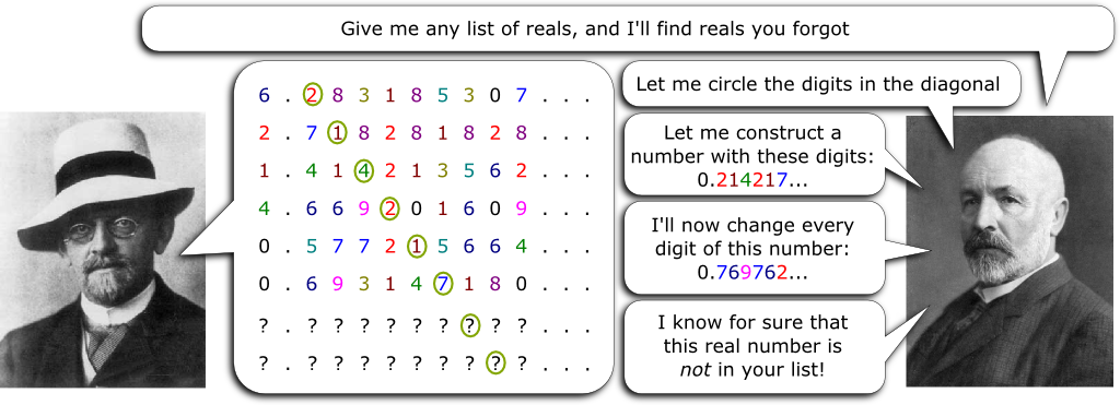
If Cantor’s proof had been clunky, the result would have been just as beneficial to mathematicians. A clunky proof woudn’t really matter as long as it was still correct. Still, elegant proofs are a delight to behold, even on repeated viewing.
Simplicity in software matters. Your product (whether it’s an app or a service) is not an end in itself but a means to an end. In the UI complexity impedes the end user from doing his task. In code complexity impedes maintainability. In software design complexity impedes flexibility. A clunky UI, a clunky design and a clunky implementation do matter.
Simplicity in software design which closely resembles elegance in mathematics, is the subject of a future blog post. Here we will stick with the user experience and in particular simplicity in the UI.
A model for the interaction of a human with the UI
A milestone in the field of usability in computer systems was the publication of “The Psychology of Human-Computer Interaction” by Card, Moran, and Newell (1983). The authors proposed a model of the “Human processor” citing ten scientific principles of operation, like Fitts’s law and the Power Law of Practice based on empirical data.

Models are useful for analysis. The suitability of a model can be judged by its predictive accuracy. Our model of human-computer interaction will be simpler than the image above which comes from the book, but it will use some of the same ideas.
Suppose automated analysis could be added to a UI design tool such as Balamiq Mockups to help assess the usability of a UI for performing a specific task at the design stage. Given a task, the UI designer would click, type and drag to complete the actions needed to complete the task using the mock, imitating the future user. These would be recorded and analyzed.
A UI can be designed to accomplish multiple tasks. For example, the same UI may be used to create an account or change a password: two distinct tasks. In that case both tasks would be considered in the analysis of the UI. These would not be given equal weight however. The weight of a task to a given persona will be proportional to its frequency. For example the number of times that task needs to be accomplished in a typical year, month or week.
Being able to accomplish a task is not enough. That’s basic suitability testing. Each interaction with and transition between UI components has a cost. Clicking on an item that is a big target costs less than if it were small. The distance the pointer has to move has a cost. Picking an item in a cluttered menu has a higher cost than clean ones. The sum of the costs is “inefficiency”. Our goal will be to minimize inefficiency over the task.
Simplicity can be measured by the amount of “ink” or “clutter” in the UI. Less is more! In a good UI the quotient of task value, divided by simplicity and efficiency is the metric by which I will judge the UI.
The sequence is not necessarily unique. Sometimes the sequence is constrained, as when a button is disabled until certain fields are filled in properly. These variation can be measured as well.
This has gotten long enough. In a future blog post I will discuss:
- the model of human behavior while interacting with a UI
- measuring the cost of learning a UI by repeated performance of the same tasks
- metric limitations, given different users have different experience levels
- use of deep learning to refine the model
References
[1] Card, Stuart K.; Moran, Thomas P.; Newell, Allen (1983). The Psychology of Human–Computer Interaction. Hillsdale, NJ: L. Erlbaum Associates. ISBN 0898592437.